Background Data
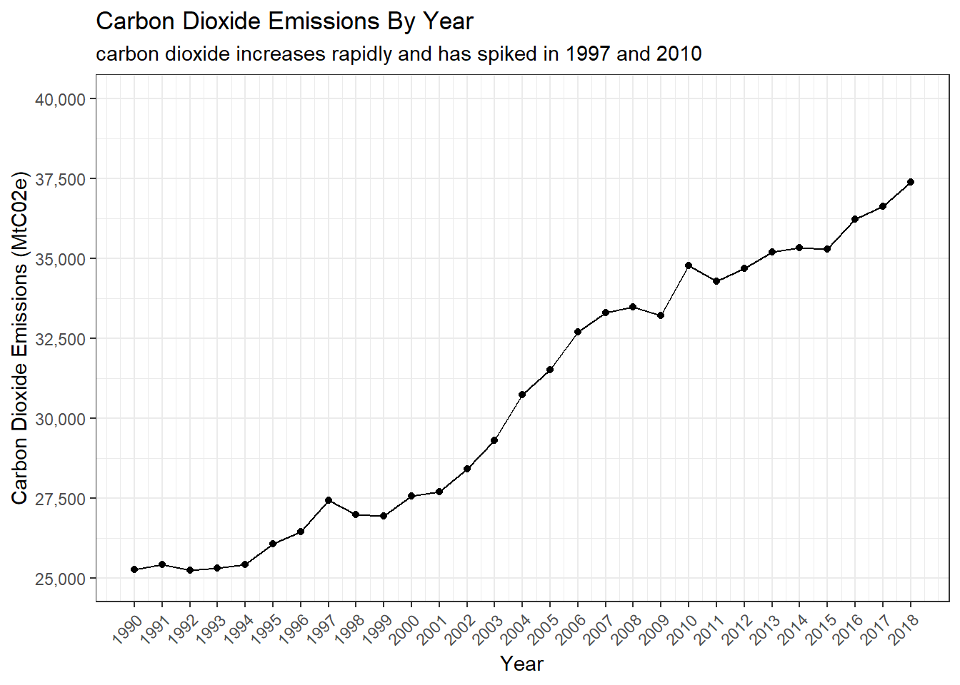
Carbon Dioxide By Year
The graph below shows the amount of C02 by metric tons in the world each year. After hearing from many other different sources that there carbon dioxide is increasing in the air, I predicted that my graph would also show that it is increasing.
The graph shows a strong positive correlation between year and carbon dioxide, but there are still some times when carbon dioxide has decreased for a short period. These times include 1992, 1998, 1999, 2009, 2011 and 2015.
Temperature Change by Year
The graph below shows that temperature change each year. The color of the dots represent the temperature (yellow = least, red = most). The black line is the best fit line for the points.

Even though the temperature change might not seem much from 1990 to 2018, it is still increasing. As long as the values are positive, the earth is going to keep warming up until we run into big problems like flooding and droughts.
Land Temperature by Year
This graph shows the land temperature over time. The dots mean the prediction of the land temperature at a certain year, and the lines mean the error margin. The error margin is pretty large, because of how small and precise the changes are. (note that this plot only goes up to 2013, because that was the latest temperature that it provided)

Similar to the previous plot, the land temperature is not changing that much. But from the best fit line, we can see that the temperature is also increasing.
Carbon Dioxide Emissions by Country
This plot shows the entire world map, and how much carbon dioxide is produce in each country. The more dark the color is, the more carbon dioxide it produced.
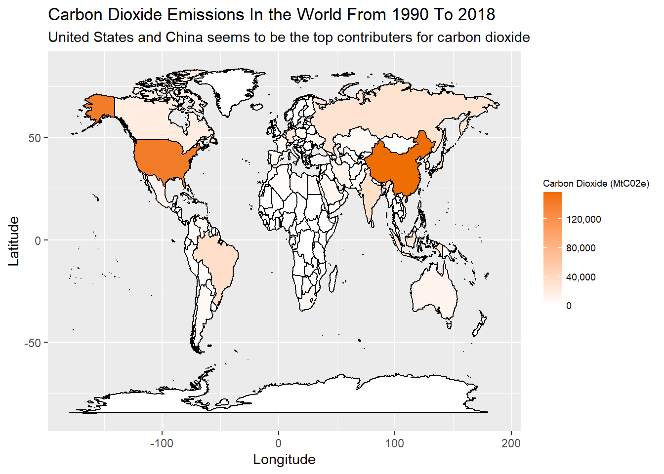
United States and China are producing the most carbon dioxide. There are a few other countries that are also producing around 40,000, but most countries are producing little to no carbon dioxide.
Carbon Dioxide Emissions by Country (in proportion to population)
This plot is similar to the previous plot, but it divides the carbon dioxide emissions by the population of the country, giving a more accurate representation of the carbon dioxide emissions by a single person in that country. (Note: the white shows that we don’t know about that country)
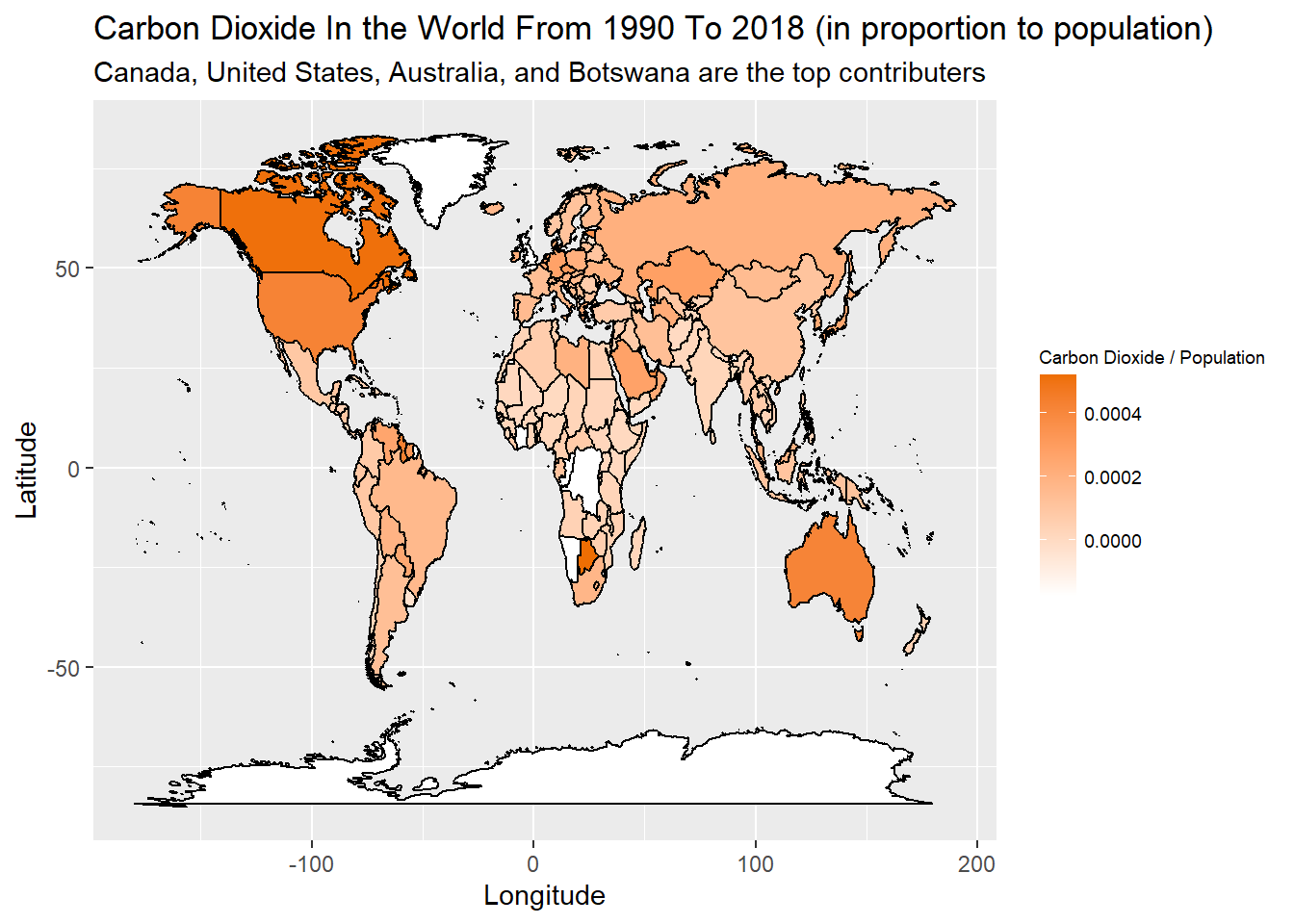
This plot shows that the carbon dioxide a person produces is generally the same throughout the world. The top contributors to carbon dioxide became Canada and Botswana.